
dandb.com: General Usability Testing
Original Ask
The dandb.com domain had not undergone any usertesting or user feedback since its original inception. This effort was my proposal to leadership to begin including user research and feedback in our roadmap process, to identify what areas were creating the most initial friction with users.
Summary of Test Learnings
UserTesting was conducted on the current state of the dandb.com website to analyze pain points, evaluate current successes, and identify opportunities to improve. Feedback came back with a few successes but many more opportunities to improve.
Overview
UserTesting feedback was started with a pilot test to evaluate flow, full test with 8 additional participants launched three days later, and evaluated the following week.
Methods
Unmoderated usability test on 9 testers. User qualifications:
25-65+ years old
Employed Full Time
Income $40,000+

Experience above the fold on dandb.com

Chat experience when not online on dandb.com
Key Findings
The key findings from the usertesting research can be broken into several categories.
Navigation
Navigation was the most consistently criticized and talked-about portion of the test experience, with 7 out of 9 usertesters reporting it felt clunky, confusing, or overwhelming. Feedback included such comments as “If I was looking for something specific, I don't know if I’d necessarily be able to find it here”, “Would you need all these products, or maybe one of them? I'm not really sure”, “There’s too much text, it’s very wordy and it’s too hard to follow”, and “Too many things going on here; it’s overwhelming”.
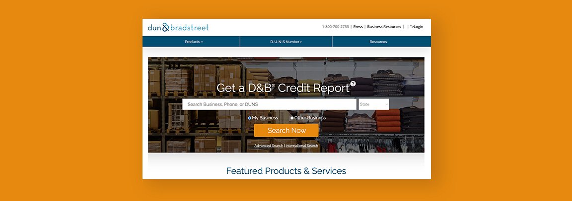
Homepage
The homepage had both positive and negative comments. The hero image messaging and search functionality gave users a clear way to start interacting with the website and a path of action to take; this was praised by 8 of the 9 usertesters with many calling it “straightforward” or “really easy (to use)”.
However, below the hero reactions got more problematic, with 6 of the 9 usertesters taking issue with the content below the hero. There was a lot of confusion surrounding why the content was there or what it was trying to communicate, especially the Featured Products section- “I’m still kind of confused [by the Featured Products section], feels like a chunk that could be better used”.
Chat Popup and Contact Functionality
The contact functionality and ease of locating phone number or chat was a consistent positive, with testers making comments like “In the middle of the page is nice, the phone number is right there so you know, you're not looking all over for the chat, it’s very nice because then you can actually talk to somebody if you have any questions or concerns”.
Unfortunately, the chat popup invite itself caused severe issues for users. At times it blocked the navigation, covered up the cart while they were using it, and became an irritant as it continued to pop up on pages. While not every user had it happen during the test, any user who did have it pop up complained about it, describing it as “annoying”, “really bad” or “unprofessional”.
Cart Experience
The cart experience was a consistent positive- no user had any issues with it and found it a smooth and easy-to-use experience. It was seen as straightforward and easy to use, and there was not a single comment to improve cart experience or userflow.
Product Pages & Copy
When getting into the product pages themselves, there were some issues with the content on the page and how it actually communicated to the user. 6 of 9 usertesters remarked on this general copy messaging and product pages, noting things such as “Doesn’t really tell me exactly what I will be getting” or that “It’s kind of lacking some value propositions- what’s in it for me, why should I choose your product over another product?”.
Overview
Overall, there were a few bright spots that provided a good experience for visitors on the website, but ultimately there are many ways that user experience and content could be improved. Another common theme with those on the website is users found it outdated, “a little simplistic”, or “almost like something somebody would make on Wix”.
Next Steps
The above issues and successes were shared with stakeholders of the project through a research readout deck and presentation, and some potential improvements were prioritized, starting with the chat popup experience.
Ready for more?
You can find additional case studies on my UX overview page below.
